photography studio in black and white

Case Study: Building Thought Leadership Through Blog Content

Skills That Deliver Results

Tag: website strategy

  • Case Study: Building Thought Leadership Through Blog Content

    Case Study: Building Thought Leadership Through Blog Content

    The Ask

    It was time to start writing Infomedia’s monthly blog, which meant it was also time to meet with other departments to brainstorm a blog topic that could serve the overall business goals and establish thought leadership.

    Each team brought a different perspective:

    • sales knew what questions prospects were asking,
    • marketing had insights into campaign goals and priorities, and
    • creative knew that the media team needed to fill their shoot calendar.

    Together, we identified a need for content that would support the sales funnel while building trust with potential clients ahead of purchasing a photography shoot.

    The Result

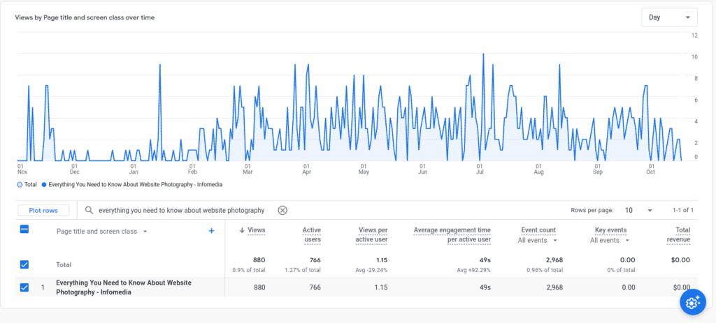
    The blog, “Everything You Need to Know About Website Photography,” became one of Infomedia’s best-performing pieces of content. It didn’t just drive traffic, it added value across the entire client journey.

    We repurposed it as evergreen content in the client training center, and both sales and media teams began using it as a trust-building touchpoint during the sales process. What started as a blog became a go-to resource that supported conversions, set expectations, and helped clients feel more confident about purchasing website photography.

    Why It Worked

    Collaboration Is Key

    I don’t pretend to know every corner of the business, and that’s exactly why I started with conversations. I met with sales and creative to understand the current business priorities and pain points. Then I sat down with the media team, who are on the front lines with clients. They knew exactly what clients were asking, what they were confused about, and what tips could make or break a successful shoot. That thought leadership made all the difference.

    Strategy First, Always

    A blog without strategy is like kayaking with a spoon — you’ll move, but you won’t get far.

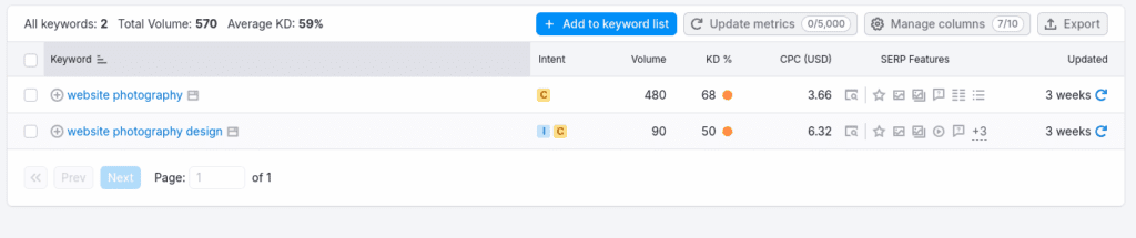
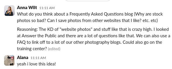
    I started with keyword research in SurferSEO and Answer the Public. The keyword density (KD%) for the term “website photography” was too competitive, but digging into long-tail queries revealed what people were really searching for:

    • How many photos do I need?
    • What do I wear?
    • Can I use stock images?

    By structuring the blog around actual client questions, I created a content asset that was genuinely useful — and that just happened to perform well in search, too.

    Write to Be Read

    This wasn’t content for content’s sake. It was designed to be referenced again and again. Clients could read it before a shoot. Sales reps could send it in follow-up emails. The media team even pulled sections to use as talking points during consultations.

    It bridged the gap between marketing and client experience. And because it answered real questions clearly, it helped reduce friction in the sales process and set everyone up for a smoother, more successful shoot.

    Thought Leadership Is Important

    By publishing a clear, comprehensive, and genuinely helpful guide, we showed that we understood the full photography process, from planning to execution. That kind of transparency builds trust.

    Clients felt more confident booking shoots with us because we had already proven we knew what we were talking about. It became a cornerstone piece of thought leadership that strengthened Infomedia’s brand reputation and supported bottom-line results.

    Lessons Learned

    Ranking Isn’t Everything

    Would it have been nice to rank for “website photography”? Of course. But what mattered just as much was creating something that both internal teams and potential clients actually used.

    This project reminded me that content strategy goes beyond keywords. It starts with collaboration, is driven by audience insight, and ends with value that lasts far beyond the publish date.

  • JH Berry: Website Copy as Branding

    JH Berry: Website Copy as Branding

    screen recording of JH Berry's hero section of their website. Website copy says "Commercial Real Estate Is Complex. We Simplify It." over a drove video of Birmingham's skyline.

    The Ask

    JH Berry needed their website copy to communicate exactly what they do — and fast. They wanted visitors to immediately understand that they help businesses lease, buy, and sell commercial real estate. On top of that, the site had to build trust. With over a century in the industry, their team had the experience — but their existing branding didn’t reflect it.

    The Result

    I delivered content that quickly communicates their services and long-standing expertise, with website copy that projects confidence without ego. The new tone says: we’ve been doing this for over 100 years, and we’re still evolving. The result is what the team called a “big-tique” brand feel — boutique service with big-market credibility.

    Why It Worked

    From headers to CTAs, the messaging is purposeful. By centering the benefits of their services and weaving in subtle nods to their legacy, I was able to position JH Berry as both experienced and forward thinking. The site builds immediate trust with visitors by answering the who, what, and why without making them dig — a strategy that aligns with how modern B2B audiences browse and make decisions. Paired with sharp design and intuitive navigation, the website copy helped bring their brand into the present without losing what made it meaningful in the first place.

  • Case Study: Brand Voice Workshop and Guide

    Case Study: Brand Voice Workshop and Guide

    The Ask

    One of the first things I do when meeting with new clients is ask a handful of basic questions to inform their content strategy. Things like:

    • Who is your audience?
    • What do you do?
    • What makes you different from your competitors?

    More often than not, I was met with long pauses, inconsistent answers, or complete uncertainty. Without clarity, the entire content phase struggled  — from strategy to execution. 

    I needed a way to get every project on track from day one. Bonus points if I could give teams the tools to stay aligned long after their website launched.

    The Results

    I created a fully interactive brand voice workshop. The deliverable was a practical, easy-to-use guide that helps teams stay on message, no matter who is behind the keyboard. 

    The final guide gives them something they’ve (usually) never had before: a clear, consistent way to talk about who they are, what they do, and why it matters. All of this is tailored to their specific audience and packaged in a way that they can actually use. In short, it makes it easy to speak with clarity and confidence, whether it is a freelancer, a new hire, or a seasoned staff member.

    Why It Worked

    Start With What You Know

    I have nearly a decade of experience creating strategies and writing copy for business, so I started with the questions I ask during the discovery phase. But I knew that wasn’t enough to fully encapsulate everything this Brand Voice Guide needed to be. I leaned into my love of learning new things and read everything I could get my hands on about brand storytelling.

    My reading list included:

    Brand Voice Has Multiple Applications

    I knew this guide couldn’t just be for the website, because the website is only one piece of the brand. If the website content says one thing and everything else says something else, it isn’t serving the business or the audience. That’s why we started with high-level positioning that could be applied anywhere: website copy, social posts, blog, newsletters, scripts, sales emails, onboarding, and more.

    Once your voice is defined, every message gets stronger — and easier to write. 

    Lessons Learned

    Brand Voice Is More Than StoryBrand

    A lot of businesses put all of their eggs in the StoryBrand basket. Don’t get me wrong, StoryBrand is great for what it is, especially if you’re starting from zero and looking for a DIY option. I’m not saying StoryBrand doesn’t work. I’m saying it isn’t enough. It’s too black and white. It lacks nuance and context.

    With this workshop and guide, I wanted to look at the business as a whole, its long-term goals, and how messaging can grow with it. The result is deeper, more flexible, and better suited to real-life content creation.

  • Website Mistakes You Don’t Know You’re Making | Part 2

    Website Mistakes You Don’t Know You’re Making | Part 2

    Even with the best intentions, common mistakes can creep in and weaken your message, damage your credibility, or even impact your search rankings. The good news? Most of them have simple enough fixes. Let’s dive into a few of the biggest website mistakes and how to avoid them. 

    Inconsistent Voice

    If you don’t have a defined brand voice, your website may be missing the mark. This disconnect often happens when different departments write their own pages. Or even when older pages were written by a different person than the more recent ones. It may not seem like a big deal. No one reads your website like a novel, after all. BUT (of course, there’s a but), a consistent brand voice is the key to building trust and credibility with your audience. When visitors click through your site, you want them to have a consistent and engaging experience. Essentially, you want your website to sound like you — authentic and unmistakably yours!

    The Solution?

    The solution is a two-step process. First, you need a defined brand voice. If you have multiple people writing for your brand, this is the only surefire way to ensure everyone is on the same page. Next, you need someone (or multiple someones) to use that brand voice guide to revise and refresh your existing website copy to match.

    Worrying Too Much About SEO

    That’s right, worrying too much about SEO is a big website mistake. I know what you’re thinking: “What do you mean? I want to rank at the top of search engine results.” Well, I didn’t say, “Don’t worry about SEO at all.” I just mean that you need to take a strategic, balanced approach to SEO.

    By now, we’ve all seen a website stuffed to the sitemap with SEO copy. Walls of text. Boring headers like “Website Copywriters in Birmingham, AL.” Buzzword overload. Keyword stuffing. While it may help you show up higher in search results (some research says it might do the opposite), what kind of user experience are you giving your users once they click on your site? Not a very good one. If you decide to write for crawlers, then you chose to NOT write for your audience. 

    The Solution?

    It’s a cliché — write it, and they will come. But it’s a cliché for a reason. When you write for your audience, maintain your brand voice, and use keywords where they’re natural, then you’re providing a good user experience. Google recognizes that and rewards you for it.

    Too Much (or Not Enough) Copy

    When I coach clients through writing their own website copy, one of the first questions is, “How much should I write?” No one likes the answer: it depends. 

    Writing website copy isn’t like writing a school paper — you’re not hitting a word count. You need to make it as long as it needs to be to tell your story and get your audience the information they need. However, I always err on the side of being more concise. Your website visitors aren’t there to read a novel. They want to quickly and easily find the information they want before moving on to the next thing. You only have a few seconds to grab their attention, so make it count. 

    On the other hand, that doesn’t mean you don’t need any copy. I hear many clients say, “People don’t read anyway.” Well, some don’t — you’re right there. But you know who does? Google. Know who else reads? Plenty of people! And why would you purposely leave out some potential customers or clients? Not to mention, having little to no website copy immediately makes it harder for people to trust you. If you don’t care enough about your business to take the time to write something down, why should they trust you?

    The Solution?

    Stick to best practices. They’re best practices for a reason, after all. When in doubt, hire a professional copywriter to help you get the job done. 

    Irregular Blogging

    Picture this: You need a landscaper, and you’re researching companies to pick the best one. You click through the About page to learn a little about the company. They sound legit. You check out their services pages. Yep, they offer the services you need. Then, you click on their blog page, and — wait, they haven’t posted anything in three years? Are they even still in business? Yikes. Guess it can’t hurt to keep searching.

    The Solution?

    The goal of a blog is usually to build trust and establish yourself as an industry expert. If you only post once every year, you’re likely doing the opposite. In a perfect world, the best solution is to blog regularly. Sit down, create a calendar, and stick to it. But we (unfortunately) don’t live in a perfect world. The next best thing is to remove the dates from your blogs. This shortcut might fool visitors, but it won’t fool Google. Realistically, if you can’t stick to blogging regularly, it may be best just to cut your blog altogether.

    What’s Next?

    If you’ve made it this far, chances are you’ve spotted at least one of these mistakes on your own website. So, what’s next? Grab a cup of coffee, pull up your site, and start taking notes. Identify what needs improvement, then create a strategy to fix it. Small changes can have a big impact. Your website is an investment — make sure it’s working as hard as it should be.

  • Website Mistakes You Don’t Know You’re Making | Part 1

    Website Mistakes You Don’t Know You’re Making | Part 1

    Your website has a lot of jobs — it needs to attract visitors, engage them, build trust, and ultimately drive action. But if it’s not working efficiently, you could miss out on valuable opportunities. The tricky part? Many common website mistakes are easy to overlook.

    The good news? A few simple tweaks can make a big difference. Let’s break down some of the most common website mistakes and how to fix them.

    Dead Ends

    Think about the pages that are a must-see for your customers. These are the pages that drive home your message and tell your audience exactly what you want them to know. This list will be different for every business. But a few that might come to mind are your service/product pages, portfolio pages, or even your about page.

    In a perfect world, your customer gets to that page — exactly where you want them. Now what? Take a look at those pages. Is there a way for them to quickly get from THAT page to the one where they can take action? Odds are the answer is no. This is what’s called a dead end.

    The Solution?

    Get creative! Consider ways to naturally direct your audience back to a desired action. You could add a video to your contact confirmation page that tells them more about your business or your process. You could (and should) add a sitewide CTA that lives at the bottom of every page, right above your footer, that directs users to the main action you want them to take. One of my favorite ways to fix a dead end is a fun 404 page that shows your brand’s personality and suggests your most commonly visited pages.

    Even something as simple as adding a “Back to Projects” button to the bottom of a portfolio page can help create a better experience and keep users on your site longer.

    Hero Sections

    Your hero section is the big banner at the top of your homepage. It’s the first thing your users will see when visiting your website. Think: above the fold. You need to immediately capture your audience and tell them:

    • Who you are,
    • What you do,
    • Why they should choose you, and
    • How they can get started

    But too often, businesses use buzzwords in their hero section instead of clearly telling their audience what they do. This common website mistakes can cost you big-time by confusing your audience.

    “If you confuse, you lose.” — Donald Miller, Building a StoryBrand

    The Solution?

    I usually recommend you avoid getting too cute or clever in the hero section. You don’t want your audience to have to think too hard to figure out what you do. BUT, that doesn’t mean your hero has to be (or should be) boring. Your hero section is a good place to start incorporating your brand voice in a creative and compelling way.

    Hero image from USTA's website. Copy in the header says "Tennis is gooooood for you."

    CTA Buttons

    This one is (almost) entirely selfish. One of my biggest pet peeves on a website is a CTA button that is a complete sentence. “Find out how our team can help you.” That’s not button copy — plain and simple. But so many people still do it! “Shorter CTA, four words max” is probably the most common feedback I give my team of freelancers. CTA buttons need to be short, snappy, simple. Get Started. Let’s Talk. View Our Projects.

    On the flip side, there’s nothing worse than the dreaded “Learn More.” Boring, uninspired, lazy.

    The Solution?

    Always, always, always use simple, specific verbs, like “Get a Website Audit” or make what you’re requesting sound valuable, “Connect With a Copywriter.” 

    Another idea is to test out first person, which makes the button part of your user’s internal dialogue. (Define My Brand Voice instead of Define Your Brand Voice.) I’ve not had as much luck with this one, but it can help you stand out since it’s not used as often.

    Wilty Wilt Test (Or WYLTIWLT)

    While I didn’t create this test, it is easy for me to remember since it has my last name (Wilt) in it. 

    When writing button copy, ask yourself:

    Would you like to [button text]? Meaning “Would you like to [get a website audit]?”

    I would like to [button text]. – Meaning “I would like to [connect with a copywriter].”

    Sitemaps

    “I want to stand out.” – every client I’ve ever met with

    Yes, it’s important to stand out in your industry. No one wants to blend in with their competitors as just another company that does XYZ. But your sitemap is NOT (I repeat: NOT) the place to get cutesy and creative. There are plenty of ways to stand out on your website — messaging, photography, videos, branding. But your sitemap is meant to quickly and easily tell your audience exactly where to find what they’re looking for. No one will spend time digging for the information they need, meaning you’ll stand out for all the wrong reasons. 

    Aside from user experience, web crawlers like Google heavily rely on your sitemap to determine what you do. If your sitemap says something silly like “Hungry?” instead of “Menu,” then Google won’t know what to do with that. 

    The Solution?

    This is one of the few times I’ll tell you to be boring and stick to simple language — About, Team, Services, Careers, Contact. Brand Voice is important, but your sitemap isn’t the place to apply it.

    What’s Next?

    A great website isn’t just about looking good — it’s about working efficiently to guide visitors toward action. If your pages leave users stranded, your CTAs blend into the background, or your navigation makes people think too hard, you’re making their experience more complicated than it needs to be. Small changes, like creating clear next steps, simplifying button copy, and keeping your sitemap intuitive, can make a big difference in how well your site performs. Fixing these website mistakes isn’t just about aesthetics; it helps you build trust, encourage engagement, and generate leads. And this is just the beginning — there’s still more to cover, so stay tuned for part two!