

Your website has a lot of jobs — it needs to attract visitors, engage them, build trust, and ultimately drive action. But if it’s not working efficiently, you could miss out on valuable opportunities. The tricky part? Many common website mistakes are easy to overlook.
The good news? A few simple tweaks can make a big difference. Let’s break down some of the most common website mistakes and how to fix them.
Dead Ends
Think about the pages that are a must-see for your customers. These are the pages that drive home your message and tell your audience exactly what you want them to know. This list will be different for every business. But a few that might come to mind are your service/product pages, portfolio pages, or even your about page.
In a perfect world, your customer gets to that page — exactly where you want them. Now what? Take a look at those pages. Is there a way for them to quickly get from THAT page to the one where they can take action? Odds are the answer is no. This is what’s called a dead end.
The Solution?
Get creative! Consider ways to naturally direct your audience back to a desired action. You could add a video to your contact confirmation page that tells them more about your business or your process. You could (and should) add a sitewide CTA that lives at the bottom of every page, right above your footer, that directs users to the main action you want them to take. One of my favorite ways to fix a dead end is a fun 404 page that shows your brand’s personality and suggests your most commonly visited pages.
Even something as simple as adding a “Back to Projects” button to the bottom of a portfolio page can help create a better experience and keep users on your site longer.
Hero Sections
Your hero section is the big banner at the top of your homepage. It’s the first thing your users will see when visiting your website. Think: above the fold. You need to immediately capture your audience and tell them:
- Who you are,
- What you do,
- Why they should choose you, and
- How they can get started
But too often, businesses use buzzwords in their hero section instead of clearly telling their audience what they do. This common website mistakes can cost you big-time by confusing your audience.
“If you confuse, you lose.” — Donald Miller, Building a StoryBrand
The Solution?
I usually recommend you avoid getting too cute or clever in the hero section. You don’t want your audience to have to think too hard to figure out what you do. BUT, that doesn’t mean your hero has to be (or should be) boring. Your hero section is a good place to start incorporating your brand voice in a creative and compelling way.
CTA Buttons
This one is (almost) entirely selfish. One of my biggest pet peeves on a website is a CTA button that is a complete sentence. “Find out how our team can help you.” That’s not button copy — plain and simple. But so many people still do it! “Shorter CTA, four words max” is probably the most common feedback I give my team of freelancers. CTA buttons need to be short, snappy, simple. Get Started. Let’s Talk. View Our Projects.
On the flip side, there’s nothing worse than the dreaded “Learn More.” Boring, uninspired, lazy.
The Solution?
Always, always, always use simple, specific verbs, like “Get a Website Audit” or make what you’re requesting sound valuable, “Connect With a Copywriter.”
Another idea is to test out first person, which makes the button part of your user’s internal dialogue. (Define My Brand Voice instead of Define Your Brand Voice.) I’ve not had as much luck with this one, but it can help you stand out since it’s not used as often.
Wilty Wilt Test (Or WYLTIWLT)
While I didn’t create this test, it is easy for me to remember since it has my last name (Wilt) in it.
When writing button copy, ask yourself:
Would you like to [button text]? Meaning “Would you like to [get a website audit]?”
I would like to [button text]. – Meaning “I would like to [connect with a copywriter].”
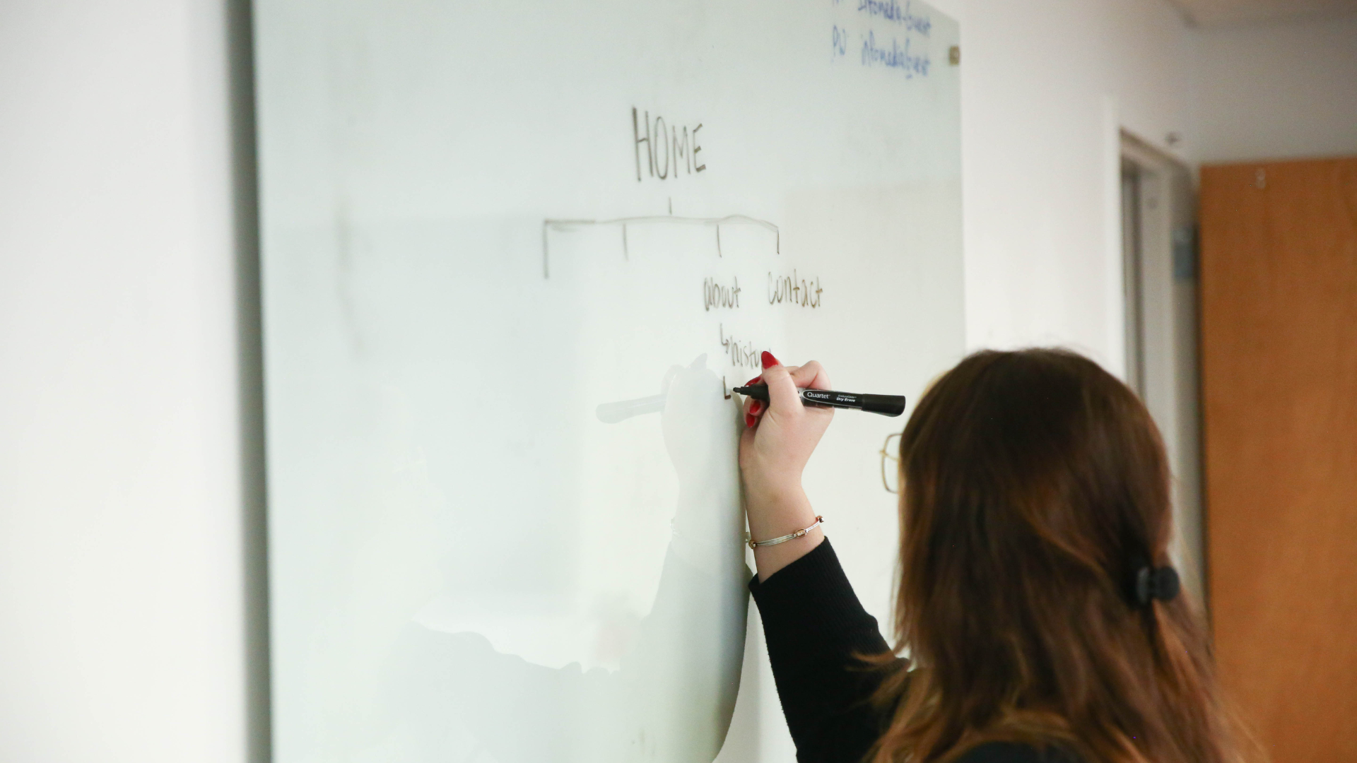
Sitemaps
“I want to stand out.” – every client I’ve ever met with
Yes, it’s important to stand out in your industry. No one wants to blend in with their competitors as just another company that does XYZ. But your sitemap is NOT (I repeat: NOT) the place to get cutesy and creative. There are plenty of ways to stand out on your website — messaging, photography, videos, branding. But your sitemap is meant to quickly and easily tell your audience exactly where to find what they’re looking for. No one will spend time digging for the information they need, meaning you’ll stand out for all the wrong reasons.
Aside from user experience, web crawlers like Google heavily rely on your sitemap to determine what you do. If your sitemap says something silly like “Hungry?” instead of “Menu,” then Google won’t know what to do with that.
The Solution?
This is one of the few times I’ll tell you to be boring and stick to simple language — About, Team, Services, Careers, Contact. Brand Voice is important, but your sitemap isn’t the place to apply it.
What’s Next?
A great website isn’t just about looking good — it’s about working efficiently to guide visitors toward action. If your pages leave users stranded, your CTAs blend into the background, or your navigation makes people think too hard, you’re making their experience more complicated than it needs to be. Small changes, like creating clear next steps, simplifying button copy, and keeping your sitemap intuitive, can make a big difference in how well your site performs. Fixing these website mistakes isn’t just about aesthetics; it helps you build trust, encourage engagement, and generate leads. And this is just the beginning — there’s still more to cover, so stay tuned for part two!